CASE STUDY
Relistor - OIC Website Redesign
A centralized hub for healthcare providers to access crucial information about RELISTOR, for OIC (opioid-induced constipation) treatment.
About The Brand
Relistorhcp.com serves as a centralized hub for healthcare providers to access essential information about RELISTOR®, its role in treating OIC, and tools to enhance patient care and medication accessibility.
This platform provides essential product information, patient resources, educational materials, and prescribing guidelines for healthcare providers. It also features savings programs, patient assistance options, and the ability to request meetings with sales representatives.
Project Scope and Objectives
The project encompassed:
- Full UI redesign aligning with updated branding guidelines.
- UX overhaul focused on increasing conversion rates.
- Support clinical decision-making for OIC and increase RELISTOR awareness.
- Expansion of omnichannel communication strategies
- Integration of key messages from the recently approved RELISTOR Sales Aid
- Technical updates to meet new regulatory requirements
- Prototype and user-testing navigation
- Optimization for mobile users
- Rebrand design and ADA guideline alignments
My Role and Responsibilities
As the Senior UX Designer, my responsibilities included:
- UI/UX Design: Creating visually appealing and user-friendly interfaces.
- User Research and Testing: Conducting in-depth research and usability tests
- Information Architecture: Organizing and structuring content for optimal user flow
- Interaction & Motion Design: Implementing micro-interactions to enhance user engagement
- Agile Collaboration: Working iteratively with cross-functional teams
- Accessibility: Ensuring the website met color contrast and accessibility standards
The Problem
The existing RELISTOR website was outdated, lacked user-friendly navigation, and did not effectively communicate key information about the medication. It decreased awareness and engagement among healthcare providers, ultimately impacting patient care.
HCPs faced friction at every turn—slow access to MOA videos, hard-to-find downloads, and a contact process that failed to generate quality leads.
Stakeholders needed a solution that would:
- Seamlessly integrate with CRM and meet compliance standards.
- Increase engagement and contact form conversions.
- Surface high-value content within two clicks.
- Simplify navigation and reduce cognitive load.
In a rapidly evolving healthcare landscape, the need for accessible and reliable information is paramount, especially regarding medications like RELISTOR® (methylnaltrexone bromide), which treats opioid-induced constipation (OIC) in adults. Healthcare professionals often face challenges finding comprehensive resources that provide clinical data and support their decision-making processes.
Discovery
Through extensive user research and competitive analysis, we discovered that healthcare professionals prioritize easy access to critical information and streamlined communication channels.
Our findings highlighted several pain points, including:
- Difficulty navigating the existing site.
- Insufficient clinical decision support tools.
- Lack of mobile optimization is crucial for on-the-go healthcare providers.
Vision
Created a centralized digital hub that empowers healthcare professionals with the information to make informed decisions about OIC treatment. By aligning the redesign with updated branding guidelines and focusing on accessibility, we aimed to enhance RELISTOR’s visibility and usability. The goal was to foster a seamless experience across all devices while ensuring compliance with regulatory requirements.
By addressing these additional needs, our vision expanded to create not just a website but a comprehensive, secure, and user-friendly platform that genuinely serves the multifaceted needs of healthcare professionals in the context of OIC treatment.
Beyond this core vision, several key areas were identified for expansion and improvement:
Specialized Content
- Catering to specific medical fields, such as Oncology and Emergency Medicine.
- Included HEOR (Health Economics and Outcomes Research) data for institutions with appropriate access controls.
Enhanced User Verification
- Maintained the integrity of current professional resources
- Added attestation processes.
- Ensured that sensitive information, like HEOR data, was only accessible to verified healthcare professionals.
Streamlined Communication
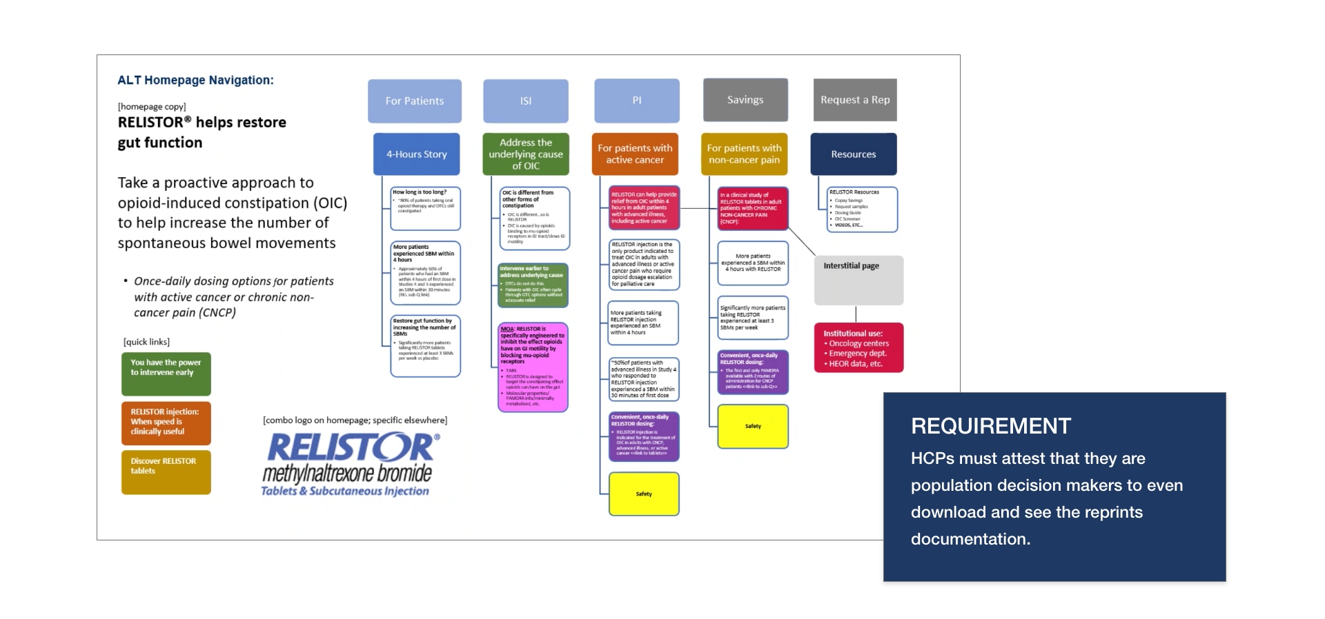
- Developed an online “Contact a Rep” form with HCP verification
- Direct communication between healthcare professionals and SALIX representatives.
Expanded Resources
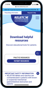
- Integrated various media content, videos, and podcasts.
- Provide diverse learning options for healthcare professionals.
Improved Navigation and Accessibility
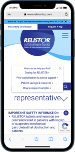
- Implemented a drop-down anchor menu with pre-selected options for more straightforward navigation.
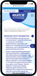
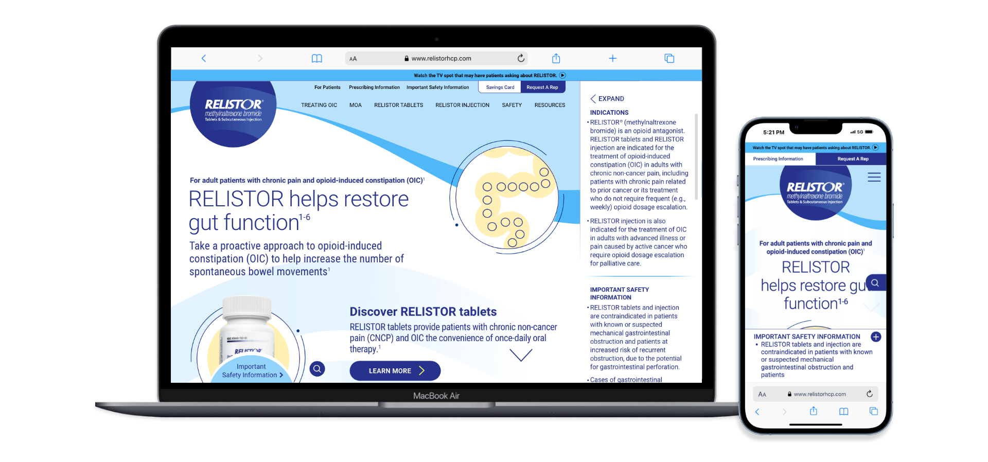
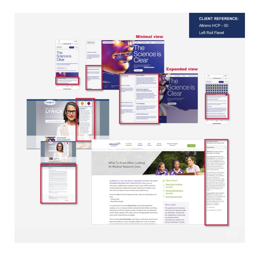
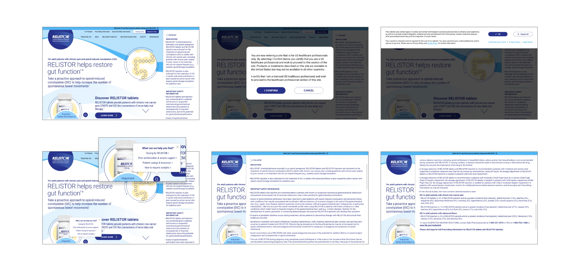
- The Important Safety Information (ISI) was relocated to an easily accessible right-side panel.
Mobile Optimization
- Recognizing the on-the-go nature of healthcare professionals
- Incorporated mobile accelerators to enhance page loading speeds on mobile devices.
Secure Access to Patient Resources
Added an interstitial requiring HCP verification for accessing copay cards, ensuring these resources reached the intended audience.
These insights underscored the importance of a user-centered design approach that addresses these challenges and enhances overall user experience.
Design Thinking
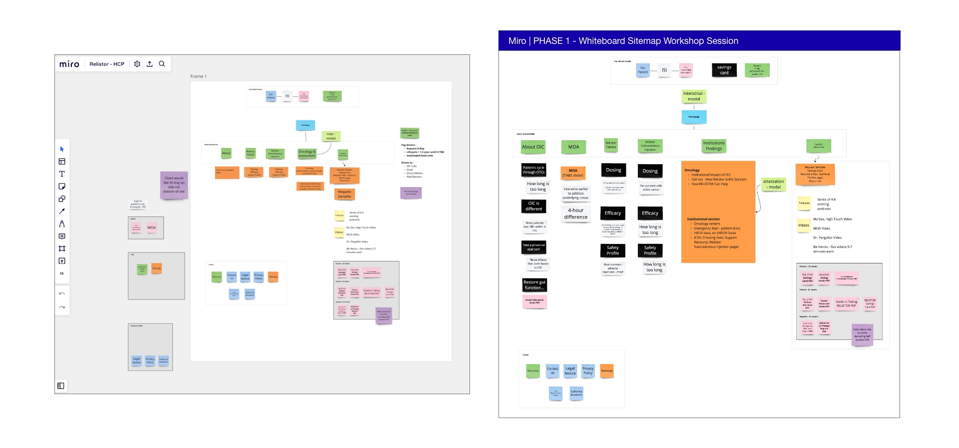
Performed a series of design thinking workshops involving cross-functional teams to facilitate this vision.
These workshops emphasized collaboration and creativity, allowing us to explore innovative solutions through iterative brainstorming sessions.
Key Sessions Included
Empathy Mapping
Understanding user needs by gathering insights from healthcare professionals.
Ideation Sessions
Generating diverse ideas for features enhancing user engagement and clinical support.
Prototyping
Developing low-fidelity prototypes to visualize concepts before implementation.
The Process
Research and Analysis
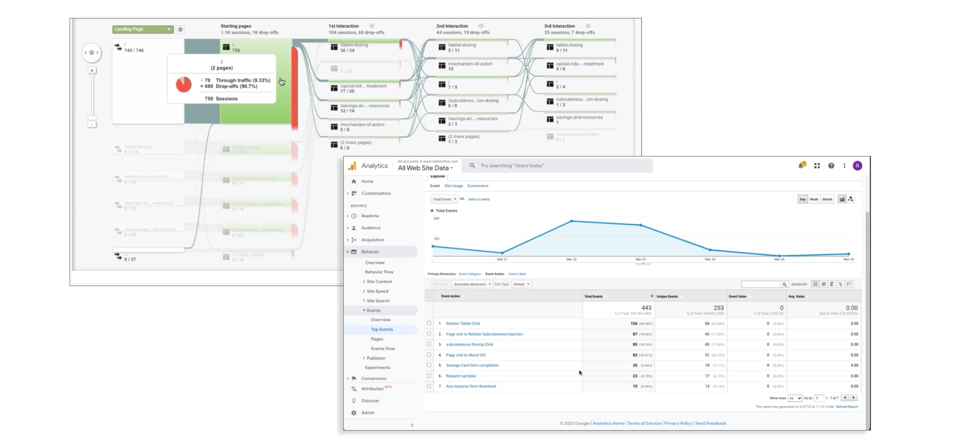
- Conducted thorough user research and competitive analysis
- Conducted user research to understand healthcare professionals’ needs and pain points
- Analyzed competitor websites and industry best practices
- Reviewed existing RELISTOR marketing materials and sales aids
Highest download per page:
Savings
and Resources
Average engagement time:
OIC Treatment
landing 00:50
Highest landing page metric rating:
MOA 50%
OIC Treatment 55%
Highest Traffic Channel:
6% Direct
6% Referral
16% Organic Search
52%
Paid Search
Information Architecture
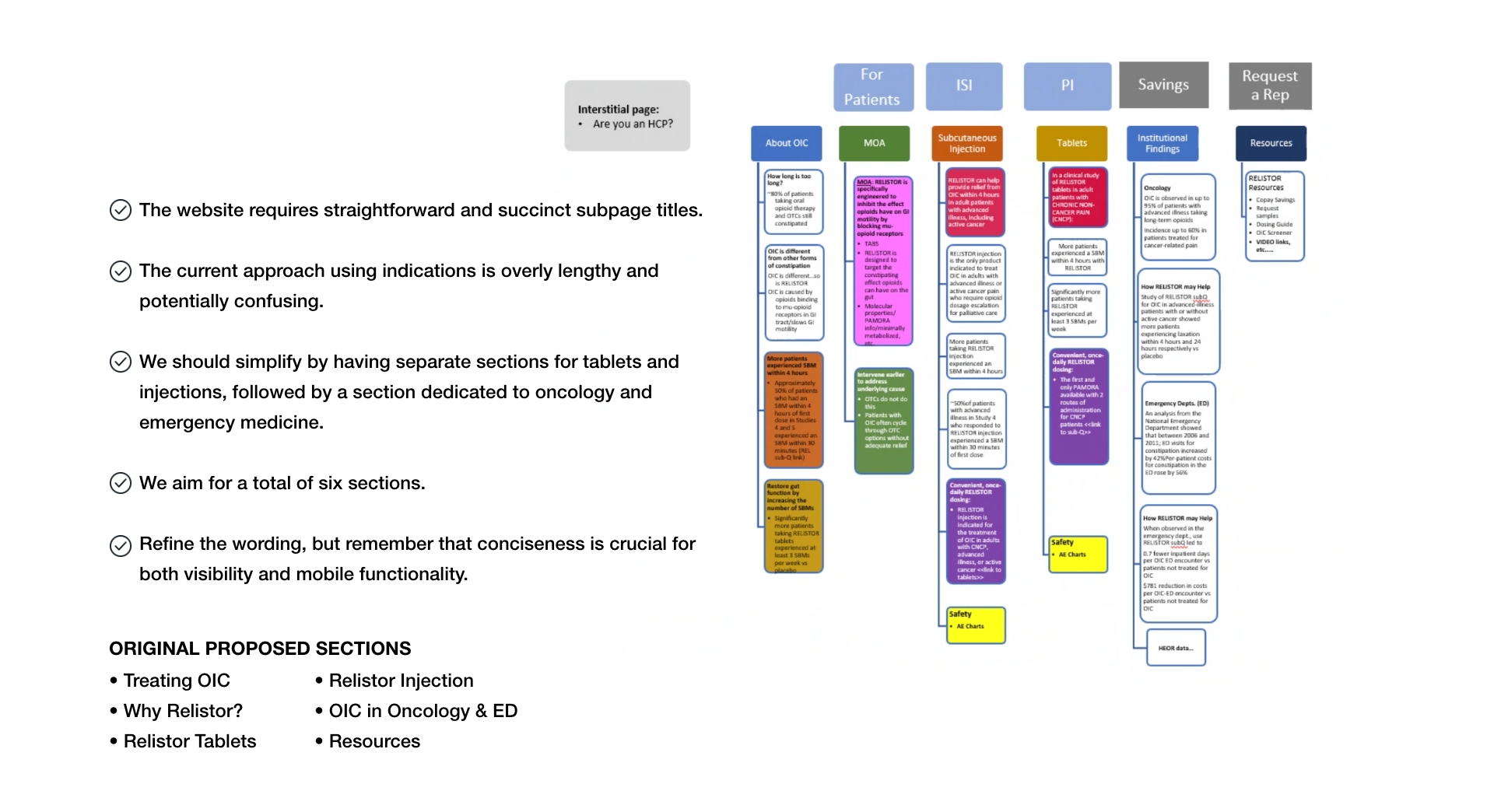
Restructured content to improve navigation and user flow. Organized clinical information to support decision-making for OIC management. Provided additional recommendations for enhanced compliance and user verification.
Key Functionality Features
Resource Access Control:
- Implement attestation on the Resource page
- Restrict HEOR data access to appropriate audiences
HCP Contact Form Enhancement:
- Add attestation to the “Contact a Rep” online form
- Ensure only verified HCPs can submit inquiries
Data Management:
- Direct form responses to SALIX for processing
Copay Card Access:
- Introduce HCP certification interstitial
- Require HCP status verification before copay card downloads
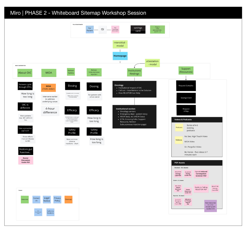
These measures aim to strengthen data security, ensure regulatory compliance, and maintain integrity of the HCP-specific resources and interactions.
High Fidelity Wireframing
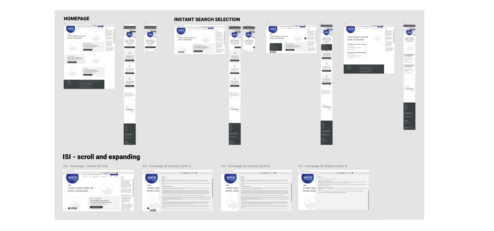
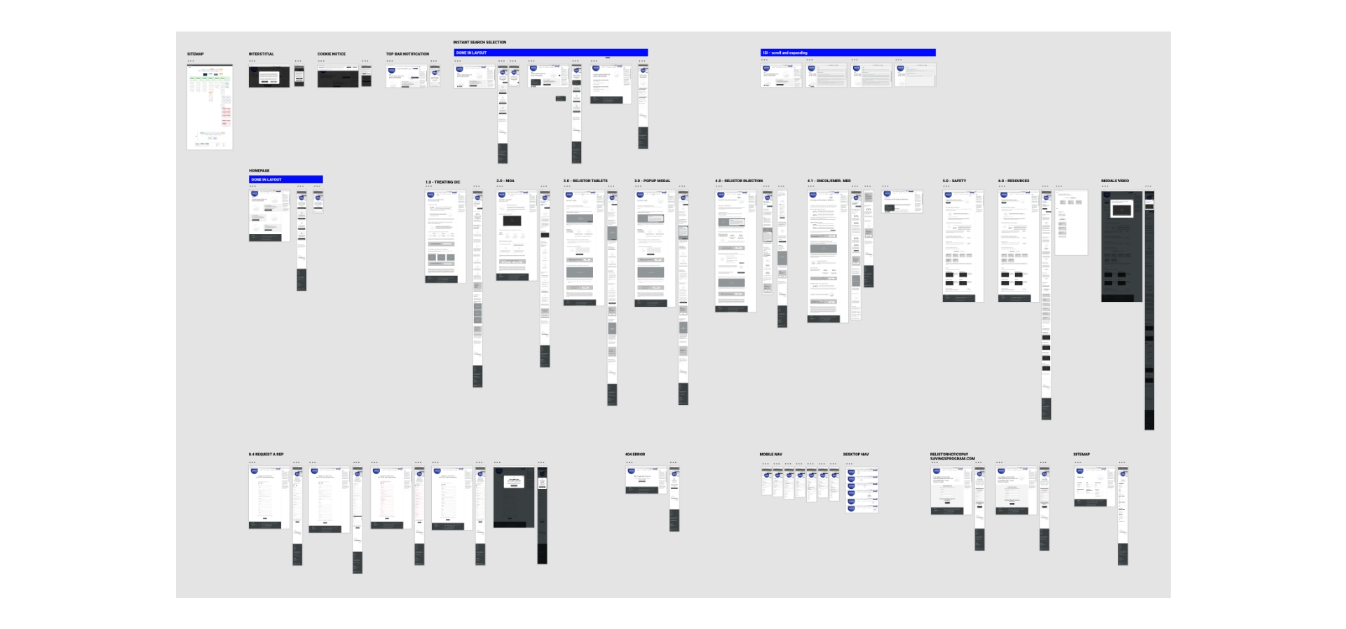
- Drafted high-fidelity wireframe iterations
- Ensured complex interactive functional components were intuitive for users and transferable with development project timelines
- Created a visually appealing design aligned with RELISTOR’s updated branding
- Developed a consistent design system for use across all digital channels
ADA Color Contrast and UI Design Reviews
As the UX Lead, I emphasize to the brand team that accessibility is not merely a compliance issue but a fundamental aspect of creating inclusive digital experiences. I recommend evaluating UI designs in grayscale, which allows us to assess contrast effectiveness independent of color. This approach is instrumental in ensuring readability across various user needs.
The use of black text on a white background remains a reliable choice for optimal readability, offering a timeless solution in design. When considering contrast ratios, adhering to WCAG 2.1 Level AA standards is crucial, aiming for a minimum of 4.5:1 for standard text and 3:1 for large text (18pt or 14pt bold). These guidelines significantly enhance user experience and accessibility.
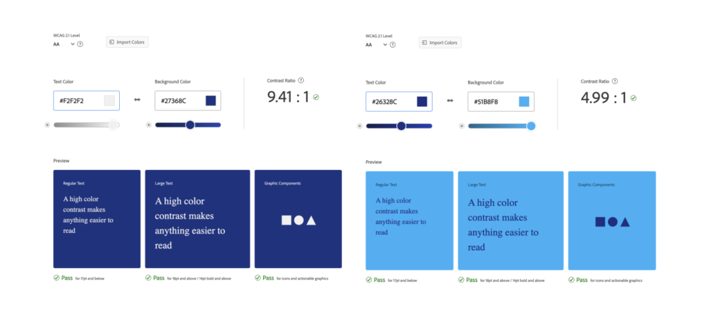
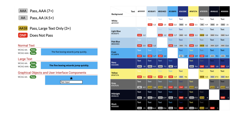
- Test UI design concepts in grayscale to ensure sufficient contrast without color
- Consider using black text on a white background for the highest readability.
- Maintain a minimum contrast ratio for large text to meet WCAG 2.1 Level AA compliance.
- Follow UI trends for larger text styles for H1 and H2s.
- Use simple and clear typography choices to enhance readability.
I advocate for simple typography choices. The goal is not to prioritize aesthetics over function but to ensure content is easily comprehensible to all users.
Ultimately, the most effective design seamlessly integrates accessibility, offering an optimal experience for every user, regardless of their abilities or circumstances. It creates a trustworthy and informative digital experience for healthcare professionals.
Visual Design
To reflect RELISTOR’s updated branding, a visually appealing design was created, and a consistent design system was developed for use across all digital components.
Grid Consistency and Quality
Design systems ensure that all visual elements and UX components follow the same guidelines.
Used a Bootstrap grid system for a 1440px desktop layout. You can utilize the extra-large (XL) breakpoint, which is designed for screens 1200px and wider. Maintain a grid of 12 columns with a gutter width of 1.5rem (24px)
Key features include
- Intuitive navigation with a structured layout
- Clear content organization, highlighting crucial topics
- Integrated multimedia for enhanced education
- Strategic placement of call-to-action elements
- Responsive design ensuring cross-device compatibility
- Adherence to accessibility standards for universal usability
The Bootstrap Grid System
Collaborated with the client’s development partner to implement a cohesive design system:
- Adhered to Bootstrap guidelines, utilizing the extra-large (XL) breakpoint for 1440px desktop layouts
- Maintained a 12-column grid structure with 1.5rem (24px) gutters
- Ensured responsive design across all screen sizes, optimizing for displays 1200px and wider
A well-defined content grid ensures that all team members adhere to the same guidelines, resulting in a practical user experience. This consistency strengthens brand identity and builds trust with users who recognize familiar interaction patterns.
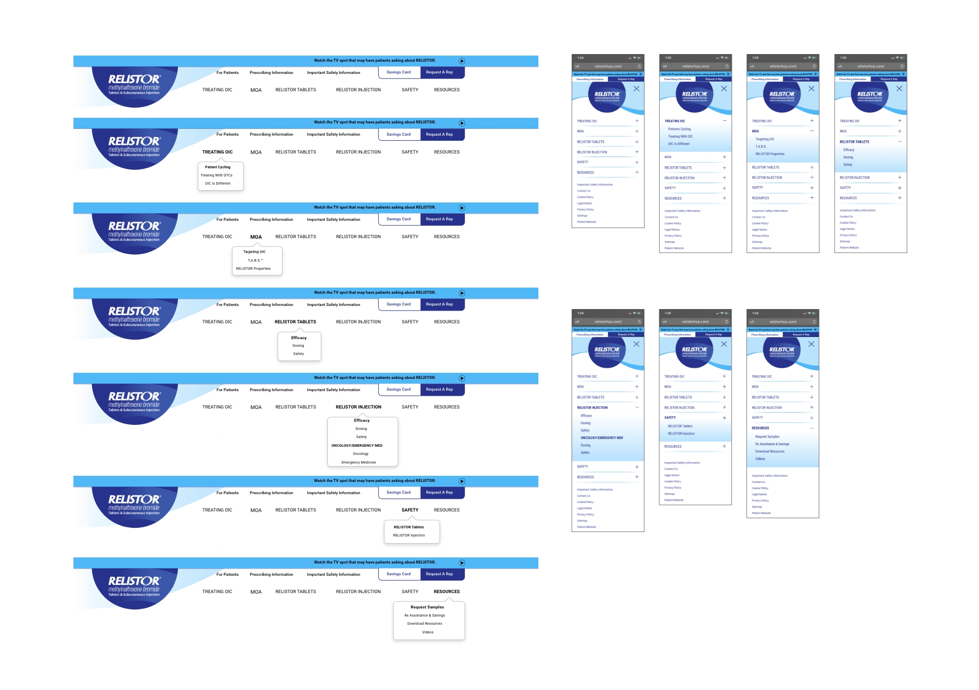
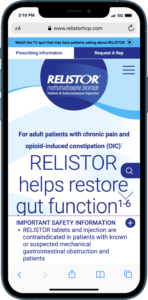
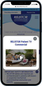
The responsive site prioritizes user-friendly navigation with a well-structured layout, featuring clear sections for topics such as the mechanism of action video and safety information.
The design incorporates a logical hierarchy of content, multimedia elements for education, and prominent call-to-action features. Adhering to accessibility standards, the site ensures readability on various platforms.

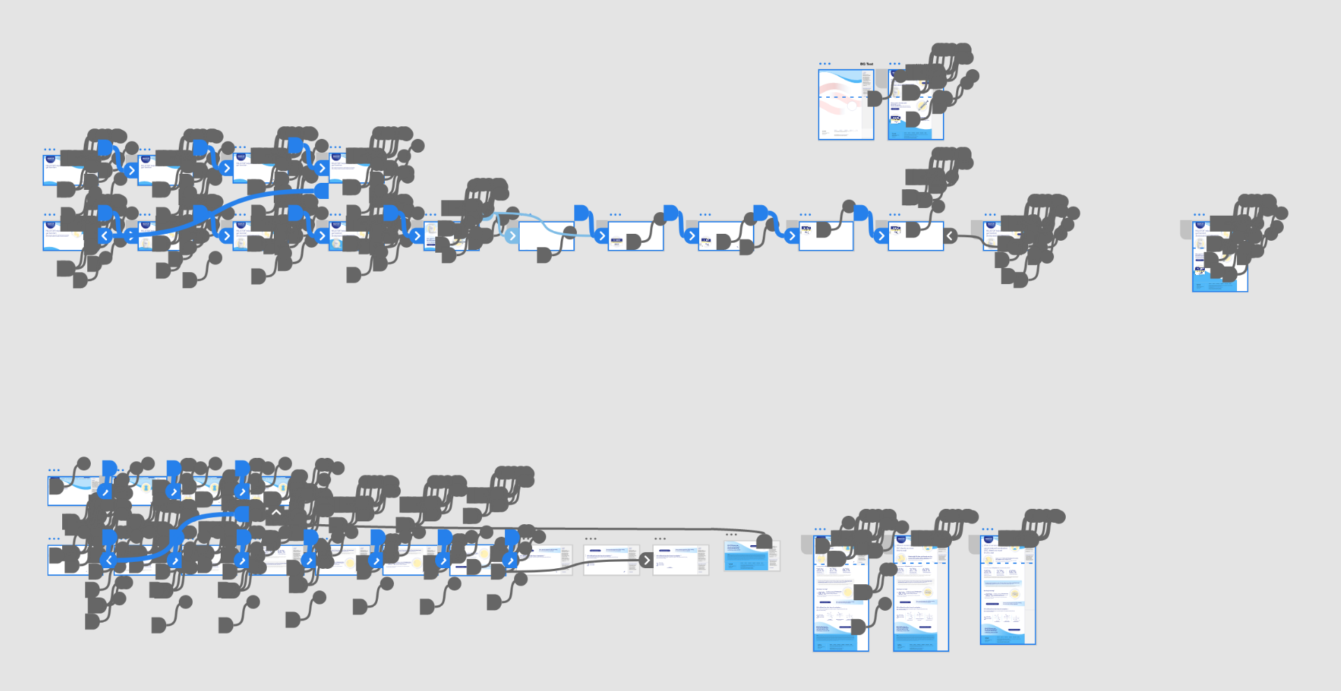
Prototyping with Dynamic Lottie Animations
Prototyping and User Testing
-
- Developed interactive prototypes for user testing
- Conducted multiple rounds of user testing with healthcare professionals
- Continuously refined the design based on user feedback and stakeholder input
- Performed extensive user testing to refine the design
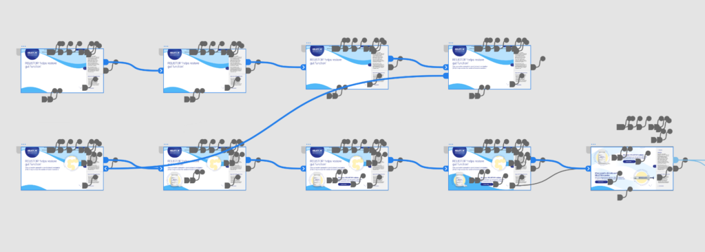
Interaction & Motion Design
Focusing on Scalability and Performance
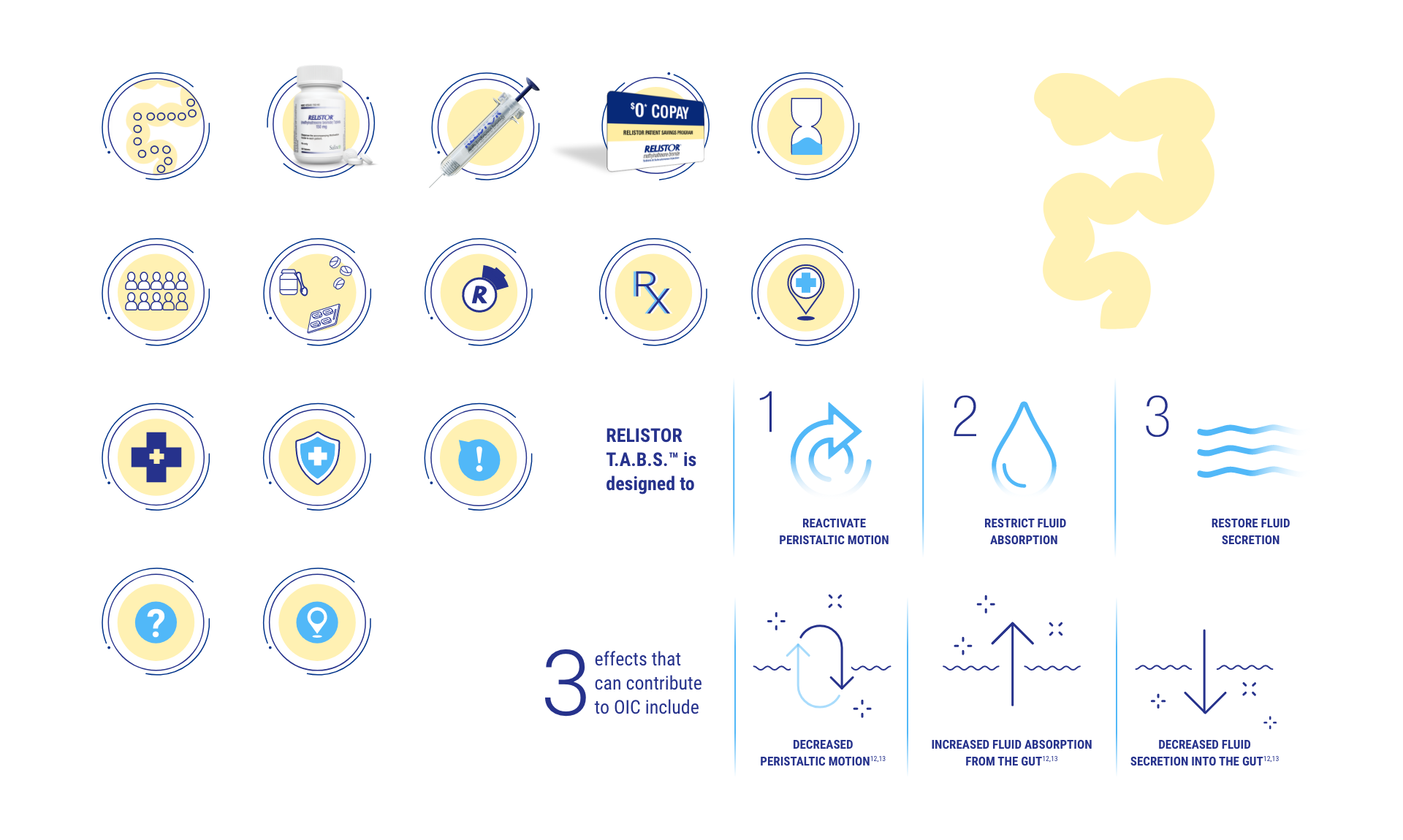
Implemented scalable Lottie micro-animations, ensuring compatibility across all platforms (phones to desktops).
These animations also offer faster load times due to their small file size, potentially improving website SEO.
-
- Enhance user engagement
- Smooth transitions and animations provide delight to the overall user experience
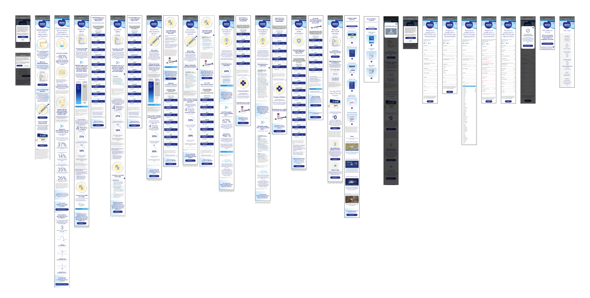
Mobile Optimization
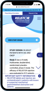
Ensured a seamless experience across all devices, focusing on mobile-first user standards.
Reflection
This project really highlighted the power of bringing everyone together—users, stakeholders, and the team—to understand what wasn’t working and shape something better. By listening, testing, and measuring along the way, I ensured every decision solved a real problem. One of my favorite moments was having everyone in the same room, mapping out user journeys, sketching prototypes, and agreeing on features. That kind of collaboration made the process smoother and the results firmer.
I also worked closely with the client’s primary regulatory compliance team to ensure all safety information was accessible, functional, and compliant. My approach was hands-on and strategic, leaving no detail overlooked. I employed an agile and collaborative approach throughout the project, conducting regular UX design sprints and feedback sessions with cross-functional teams.
WHAT I LEARNED & THE BIG WIN
After launch, the feedback spoke for itself. When I learned the client wanted us to develop their Veeva iPad e-detail sales aid next, I jumped out of my seat. Stakeholders were genuinely impressed, especially with the positive reactions from sales reps who found engaging HCPs and sharing resources much easier. It was exciting to see how our user-centered approach solved immediate problems and sparked new opportunities to help the sales team connect with HCPs more personally and effectively. Seeing good UX and thoughtful design tighten the communication circle for everyone involved is gratifying.
